Free online sunburst chart maker
Unleash your creativity with EdrawMind's sunburst charts.
Effortlessly map out thoughts, explore ideas, and connect the
dots in a visually engaging and productivity-enhancing way.

AI-powered sunburst chart maker Hot


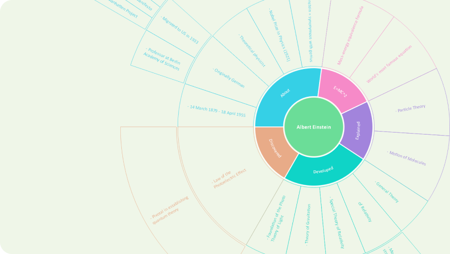
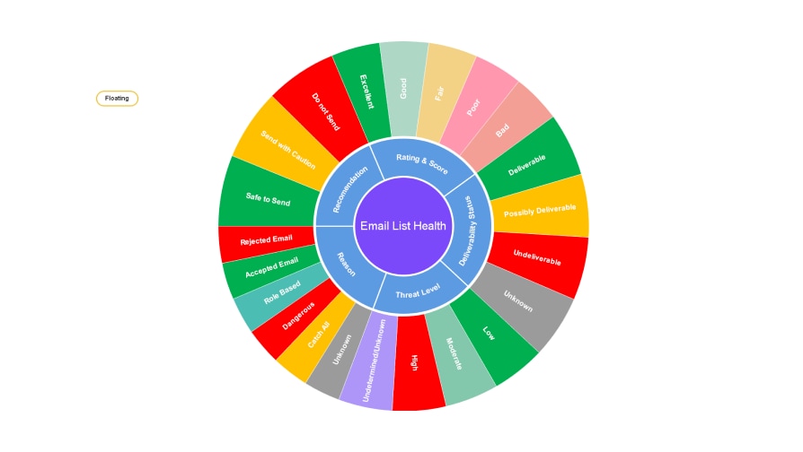
What is a sunburst chart ?
A sunburst chart is a hierarchical visualization that represents
data in a circular shape. It shows the parent-child relationships
between data categories, allowing for a detailed analysis of the
data at different levels. Each level is represented by a ring, with
segments divided into arcs based on their proportional values,
creating a sunburst-like appearance.

 Identify top-performing products
Analyze sales data with a sunburst chart, especially when there
are multiple levels of categorization, such as product
categories, subcategories, and individual products. Uncover
hidden gems in sales data to identify top-performing categories
or products at different levels, discuss a chapter or a book,
and brainstorm ideas for a project.

 Allocate budget plainly
Gain a clear overview of the distributed funds when allocating
the budget to different departments or cost centers. With a
sunburst chart, you can see clearly how much budget is allocated
to which department, sub-department, and even individual cost
items.

 Decode website traffic
Examine website traffic patterns and visitor behavior. Use each
level of the sunburst chart to represent different dimensions
such as traffic sources, pages visited, or time on site. You
will find it way easier to identify which sources are driving
the most traffic, which pages are most popular, and how visitors
navigate through the website.
How to make a sunburst chart?

-
Step 1: Prepare data
Collect and organize the data you want to represent in the chart. Identify the hierarchical structure, as sunburst charts represent nested categories. -
Step 2: Choose a tool
Select a software program that supports the creation of sunburst charts. Some popular options include Microsoft Excel, Google Sheets, and EdrawMind. -
Step 3: Configure the chart
Configure the sunburst chart, mapping data to respective levels, adjusting segment sizes, and selecting color schemes for differentiation. -
Step 4: Refine and interprete
Refine the chart for clarity, adjust labels and colors, analyze patterns, and add interactive elements if available.
Sunburst chart templates in EdrawMind

EdrawMinder voices

A great solution for students, teams, and
decision-makers to work together, share ideas, and
break down complex topics.
I found EdrawMind to be very useful and helpful in
assisting me in my ability to simplify complex
knowledge, information, and ideas into orderly
structured mind maps.
It has all the features that every user needs.
There's no other mind map app on the marketplace
that is at the same level as they are. EdrawMind is
a supreme product.

FAQs on sunburst chart makers
1. Are there any free websites for making sunburst charts?
There are numerous online tools for making sunburst charts. Some popular free platforms are EdrawMind Online and Lucidchart, which offer free versions with access to basic functions.
2. How to create a sunburst chart in Excel?
To create a sunburst chart in Excel: First, organize your
data hierarchically in a table. Then, select the data and
go to the 'Insert' tab. Click on 'Hierarchy Chart' and
choose 'Sunburst'. Excel will automatically generate the
sunburst chart, which you can then customize and format as
needed.
3. How do I create a sunburst chart in Google Sheets?
Create a sunburst chart by organizing hierarchical data in
columns. Select your data, click on "Insert" in the menu,
choose "Chart," then under the "Chart type" dropdown,
select "Sunburst chart." Google Sheets will generate the
chart, which you can then customize and format as
required.
4. What is the difference between a sunburst chart and a
tree map?
Treemaps are optimized to show lots of data because they
stretch to within their bounding box, whereas plotting a
Sunburst is fitting a circular chart into any rectangular
window. Space that could be used to tell a story with your
data is lost in the corners.
5. Can we make a sunburst chart in Tableau?
Yes, Tableau supports sunburst chart creation. Prepare
hierarchical data, then use Tableau's interface to build
the chart, customizing angles, radii, and hierarchy
levels. Customize colors, sizes, and labels for clarity,
and optionally add interactive elements like tooltips or
filters for enhanced data exploration.
Ignite your creativity with EdrawMind AI's futuristic mind mapping.